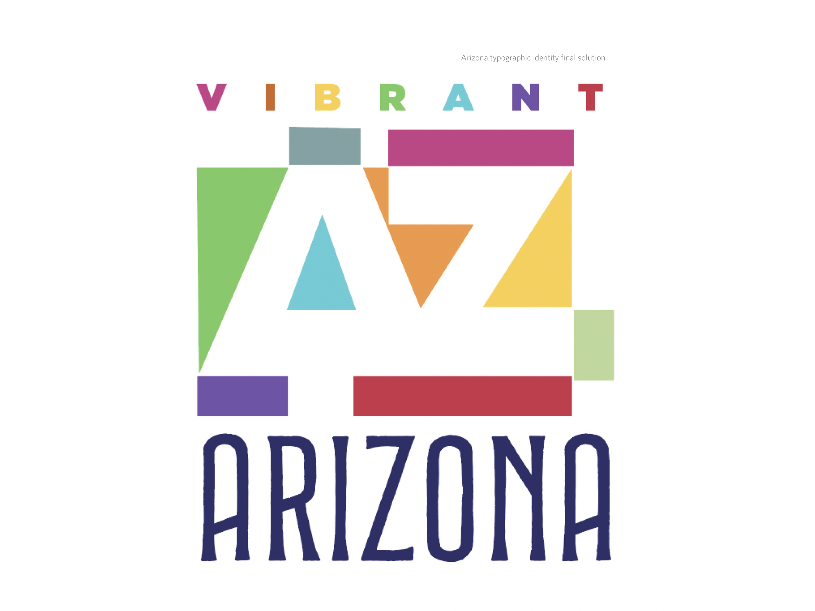
This study was executed to integrate typographic characters with found imagery that reflect the structure and overall historic usage of 13 different type families.
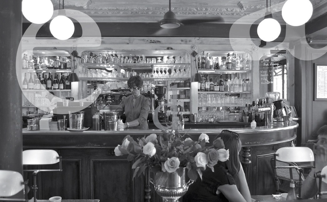
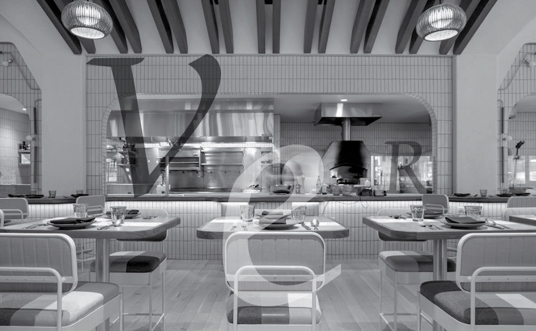
Garamond is a popular French classic typeface that is flexible, as it is both elegant and legible. Because of this, it is widely used in many applications, from smaller book print to large signage. Garamond is the typeface chosen for the Google logo. I"ve included interesting selections of the type imposed over an image of a French bistro where it could be utilized.
Baskerville is a transitional English serif typeface that was designed with the intention of perfecting on Caslon. It is considered elegant and intellectual. Clean with oldstyle flair, it lends itself well to document and book print. Baskerville is the display type chosen for the Better Homes and Gardens magazine. Ive included interesting selections of the type imposed over an image of an English pub where it could be utilized.
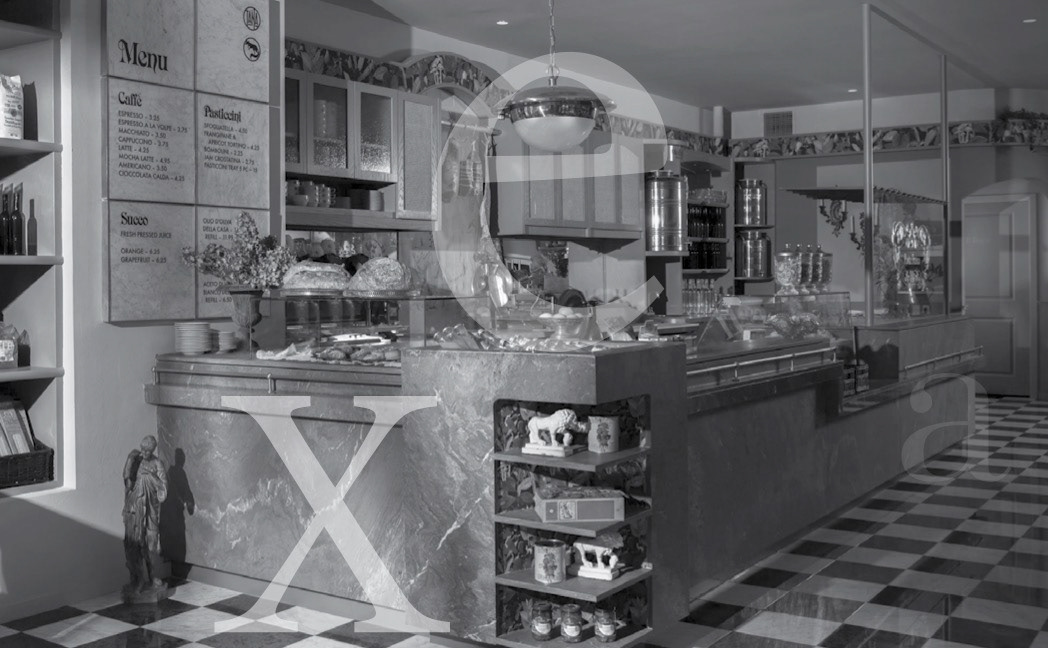
Bodoni is a modern Italian serif typeface designed with the influence of Baskerville. Lightly condensed with unbracketed serfs and strong contrast in line weight, Bodoni Is prominent in logo design but is used in some magazine publications as main type. It was chosen for the Armani Exchange logo and is used as the main type of Harper’s Bazaar. Ive included interesting selections of the type imposed over an image of an Italian trattoria where it could be utilized.
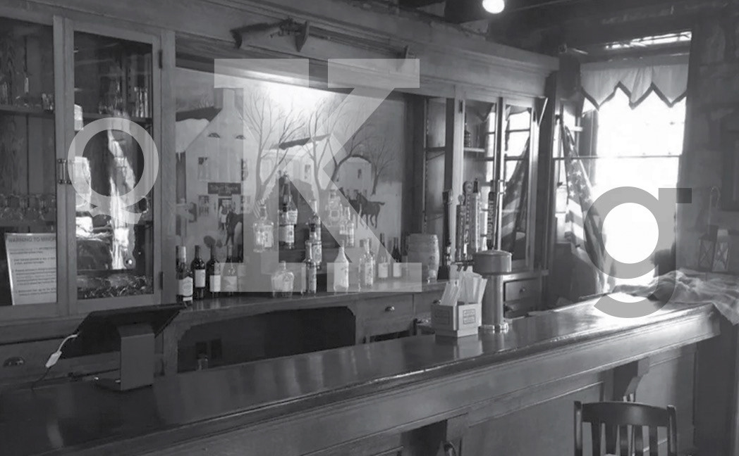
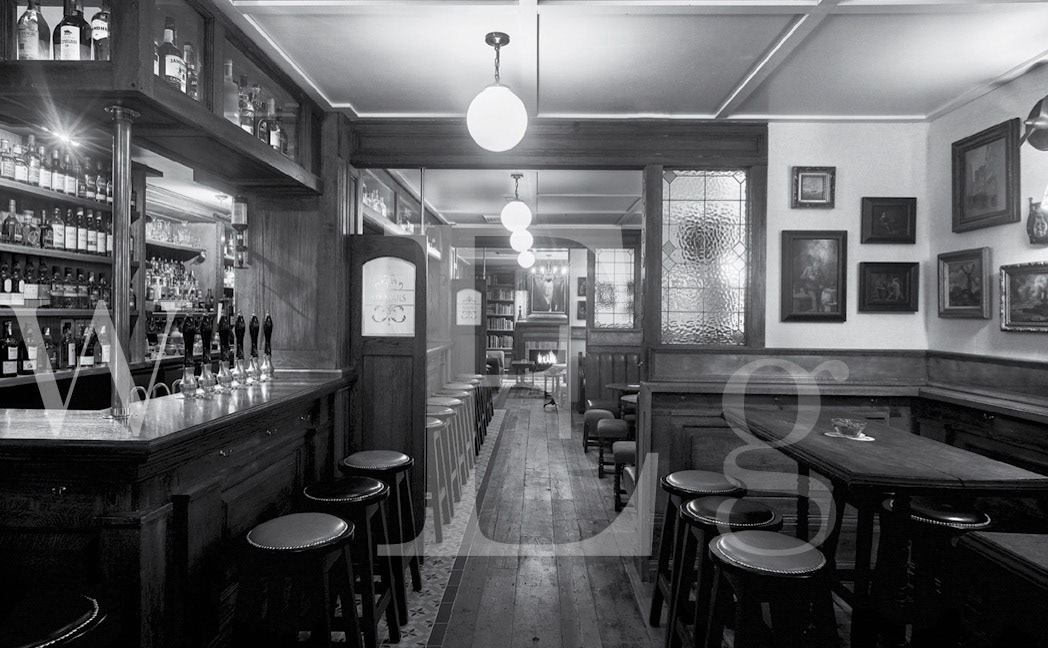
Rockwell is an American mono-weighted slab-serif typeface that is primarily used for large display and logo creation because of it’s robust, sturdy design. It has been chosen for use by the Guinness Book of World Records and the American fast food chain ARBY’S. Ive included interesting selections of the type imposed over an image of an American bar where it could be utilized.
Futura is a German mono-weighted typeface, with minimal and symmetrical attributes, that give it a light, airy feel. Popular in both body and display applications, it has been adopted by many brands including Nike and Volkswagen. Ive included interesting selections of the type imposed over an image of a German cafe where it could be utilized.
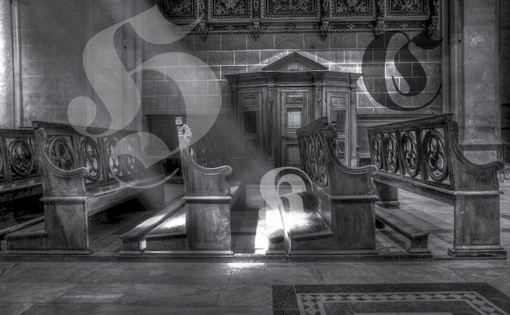
Fraktur is a German traditional calligraphic typeface. Because of it’s decorative heavy gothic nature, it’s mostly underutilized in modern settings outside of specialized text or signage. Ive included interesting selections of the type imposed over an image of an Renaissance church where it could be utilized.
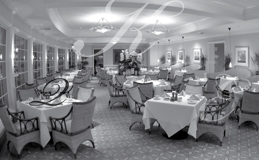
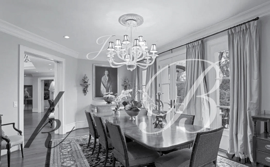
Bickham is an American designed calligraphic typeface based on engravings from the 1700’s. Because of it’s “fancy”, flourished nature, it is primarily used for display purposes, lending itself to other applications such as “invitations” and menu formats. Ive included interesting selections of the type imposed over an image of an American upscale dining area where it could be utilized.
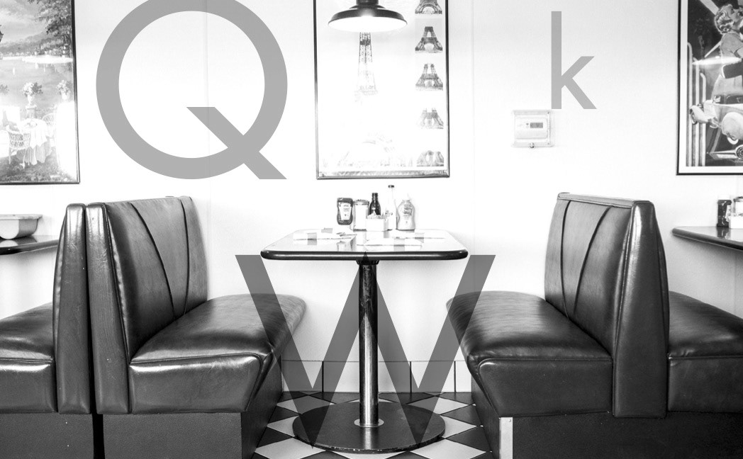
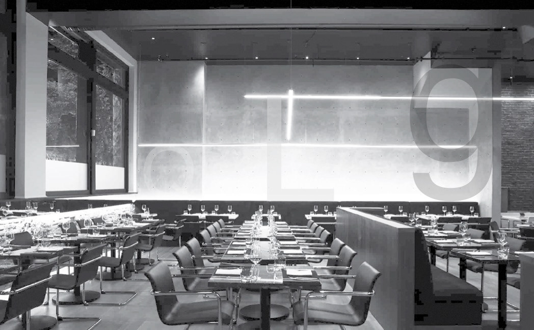
Chancery is a contemporary unconnected script with medium variation in line weight. The typeface has strong legibility for short texts that can add some slight flair. Chancery was included, and popular, with the first core font package by Apple Computers. Ive included interesting selections of the type imposed over an image of a late 70’s restaurant where it could be utilized.
Snell Roundhand is a British formal script that reflects puritan ideals and can be elegant and festive. Used mostly with mid-length text and headline, it is considered a modern classic calligraphic typeface. Ive included interesting selections of the type imposed over an image of a British parlor where it could be utilized.
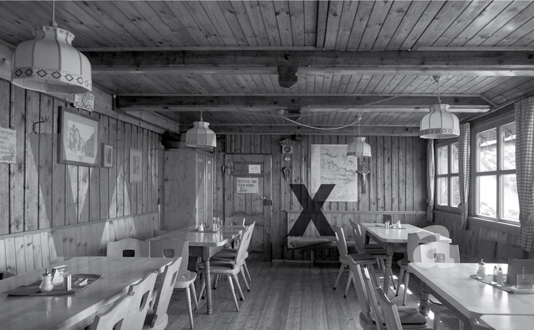
Syntax is a heavy Swiss humanist sans-serif typeface. Being of heavy weight and sans-serif, Syntax does not read well for text and is used primarily for display purposes. Ive included interesting selections of the type imposed over an image of an Swiss Inn where it could be utilized.
Helvetica is a Swiss sans-serif widely used for both medium text and display. It’s small apertures and solid, dense appearance, limit it’s legibility in small print. Helvetica is used extensively for corporate display signage including the likes of 3M, Toyota and Target. Ive included interesting selections of the type imposed over an image of a corporate environment where it could be utilized.
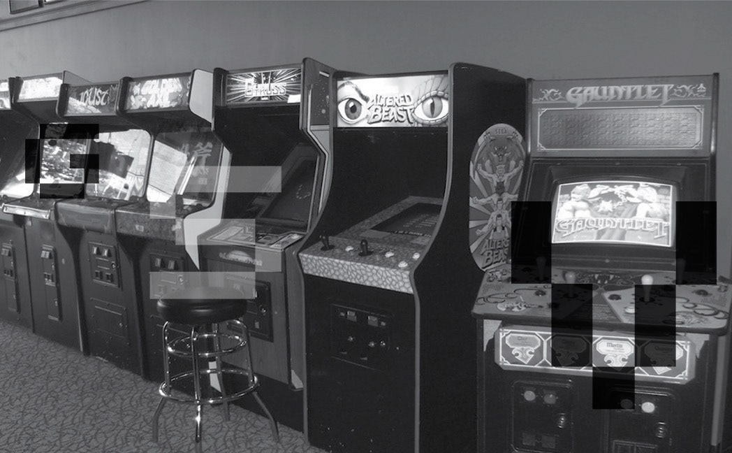
Sevenet is a specialized bitmap typeface based on a 5x5 pixel grid, with an occasional ascender or descender. Ive included interesting selections of the type imposed over an image of an arcade utilizing 8-bit graphics where it could be utilized.
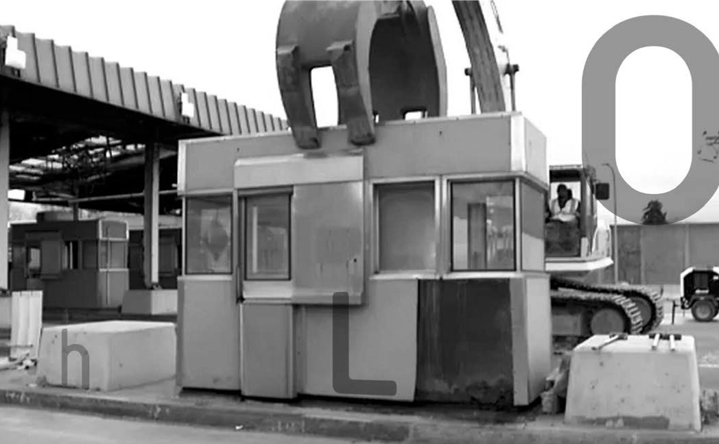
Platelet is an American typeface inspired by government issued vehicle license plates. Because of it’s mono-spaced, sans-serif characteristics, it is rarely used for text usage. Ive included interesting selections of the type imposed over an image of a toll booth where an operator would have been exposed to it throughout the day